Music Marketing
Music Marketing
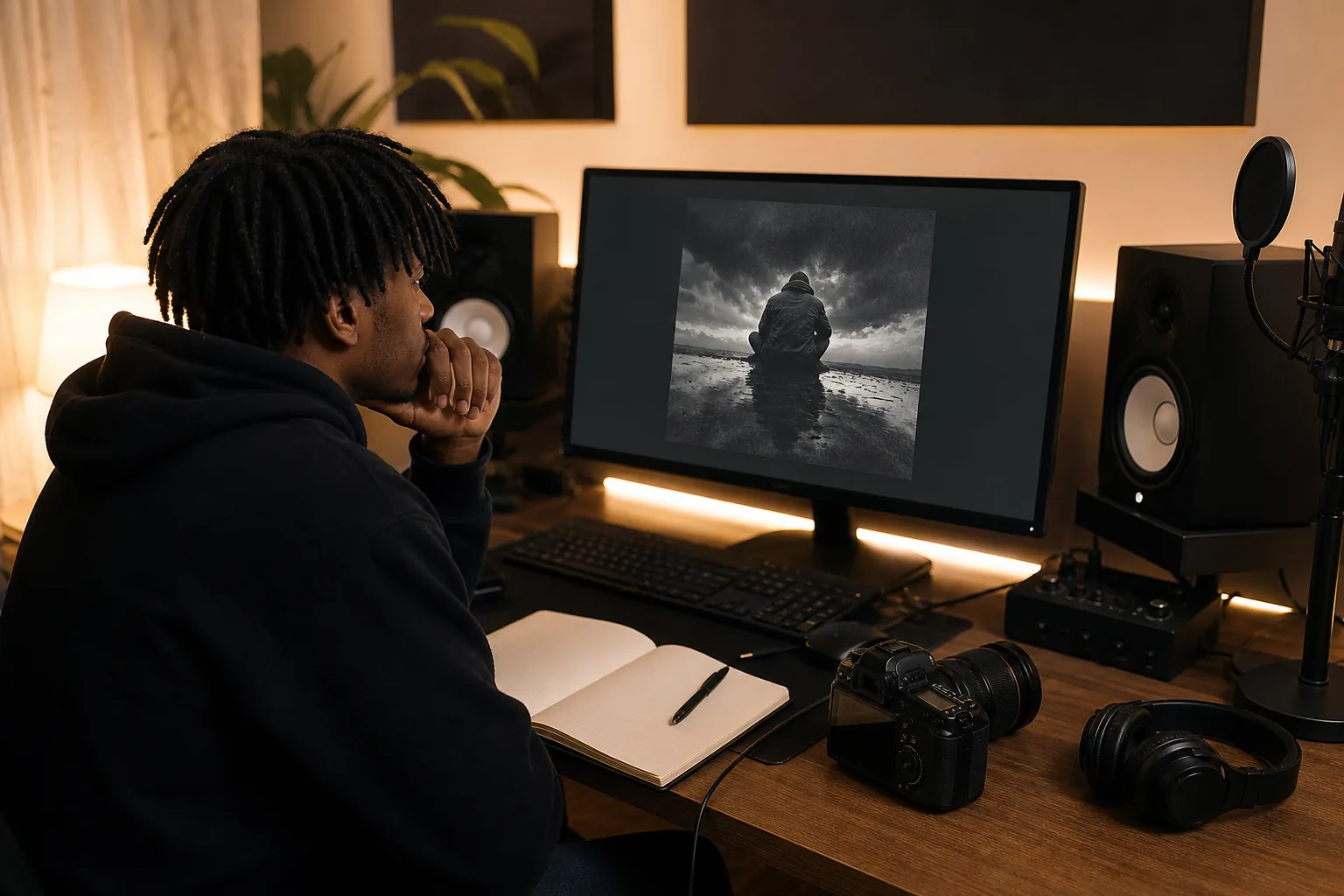
A blank square can make a finished track feel unfinished. The right album cover maker helps you turn the song's mood into artwork that works on streaming pages, social posts, and physical releases. Start with the workflow below, then give your cover enough detail to feel like part of the music.
Table of Contents
Step 3: Customize Templates With Typography, Color, and Layout
Step 5: Check Image Rights and Build Promotion-Ready Artwork
Step 1: Choose the Right Album Cover Maker for Your Project
An album cover maker is a design tool with templates, image controls, text tools, or AI features. Pick one based on the job, not the flashiest demo.
For a fast single cover, choose a template-led editor. You can swap in your photo, change the title, then adjust the color and crop. Template libraries help when you already know the mood but don't want to build a layout from zero. Editors such as PicMonkey describe this workflow as choosing a template, replacing the image, then adjusting text and effects.
For a more personal record, start with your own photo or a simple graphic. You can also work with an AI image tool, but treat its output as a starting image. AI can miss readable type, hands, faces, or small visual details. Add the final artist name and title yourself.
Indepth Jay Beats is a good first stop when the cover needs to match the beat's sound. I make hip hop, trap, boom-bap, and R&B instrumentals, so you can choose the visual direction after you know the record's pace and tone. Need a dark trap cover? Start with a dark trap beat. That gives the artwork a better base than guessing from a blank screen.
Use a template when speed matters and the release is simple.
Use your own photo when the artist or setting carries the story.
Use AI for concept work when you need unusual scenes or mood boards.
Use custom production when the song and its visual identity need to grow together.
Before you pick a tool, check whether it can export a large square file. Also check its font and image license terms. A pretty preview won't help if the file is too small or the stock image can't be used for a paid release.
Key Takeaway: Pick the editor that fits your source material, export needs, and rights plan.
Step 2: Turn Your Music Into a Clear Visual Story
A strong album cover starts with a clear idea, not a pile of effects. Play the track before you search for images.
Write down three things: the mood, the setting, and the main image. Keep each answer short. A boom-bap track might point to worn film grain, a city block, and a close portrait. A smooth R&B single might need soft light, open space, and one calm color. Your answers give the design a lane.
Next, find the song's strongest visual phrase. Maybe the hook talks about late-night drives. Maybe the verse keeps returning to an old neighborhood. Use that image as the hero. Don't squeeze every lyric onto the cover. One clear idea is easier to read at thumbnail size.
Look at the whole project too. A single can focus on one moment. An EP needs a shared look across several covers. Keep one detail consistent, such as the type style, color family, or photo treatment. That makes the releases feel connected without making them all look the same.
Artist identity matters here. If your name is hard to spot, promotion gets harder. Put the artist name and title where they remain readable after a streaming app shrinks the image. Test the cover as a tiny square before you call it done.
When I help an artist choose a beat at Indepth Jay Beats' hip hop beat shop, I listen for the visual clues inside the production. A dusty sample suggests one treatment. Clean synths suggest another. The cover should sound like the record before anyone presses play.
Use Reference Images With Care
Build a small mood board with colors, textures, poses, and places. Use it to guide your choices, not to copy another artist's cover. A reference board can show you that your idea needs more empty space, a warmer tint, or a less busy background.
Let the song lead. If the cover looks cool but feels unrelated to the track, start over.
Step 3: Customize Templates With Typography, Color, and Layout
Templates save time, but your edits give the cover its voice. Start with type, color, and layout before adding texture.
Choose one main font for the title. A second font can work for the artist name, but keep the difference clear. A condensed sans serif can feel sharp and modern. A serif can feel classic or reflective. A rough handwritten style can fit a raw record, yet it may become hard to read at small size.
Write the artist name in full before you judge the layout. Check the spacing around each letter. Then shrink the cover until it is about the size of a music app thumbnail. If the title turns into a gray blur, make the type larger or simplify the background.
Color sets the first mood. Dark blue can feel cold or late. Red can bring heat or danger. Cream and brown can suggest age when paired with grain. These aren't fixed rules. They are starting points. Use one main color, one support color, and enough contrast for the words to stand clear.
Composition controls where the eye lands. Give the main image room. Place the title near a quiet part of the photo. A simple grid can keep the margins even. You can break the grid later, but first build a layout that holds together.
Texture works best when it supports the story. Try a light grain layer for a worn tape feel. Try a soft blur behind the title when the photo is busy. Don't stack filters just because the editor has them. If every part shouts, the cover has no focal point.
For artists who want the song built around a precise idea, commissioning a custom beat can help. A clear brief gives the producer your mood, references, and intended use. The same brief can guide the cover artist later.
Pro Tip: Save three versions before you settle. Compare them at full size, thumbnail size, and in black and white.
Step 4: Export Artwork for Streaming, Vinyl, and CD
Export the cover for its final home. A streaming image and a vinyl sleeve may share the same front art, but they don't share the same file setup.
For a digital release, export a large square file in the format your distributor accepts. Keep the artist name and title inside a safe area. Avoid tiny type because platforms may show the cover at a very small size. Open the final file on your phone before delivery. That quick check catches weak contrast fast.
For vinyl or CD, ask the plant for its exact template before you design the print file. The template should show the trim line, bleed, and safe zone. Bleed is extra artwork beyond the cut edge. The safe zone keeps key text away from areas that may shift during trimming.
Don't assume the digital cover can go straight to print. Print work may need CMYK color, while screen artwork often starts in RGB. Colors can change during conversion. A bright screen blue may print with a different feel. Ask for a proof when the release budget allows it.
Keep the master file with its layers. Export a clean delivery copy separately. Name files clearly, such as artist-title-front-cover, then keep the source file in a backed-up folder. This makes later edits much easier when a distributor asks for a new crop.
The RGB color model uses red, green, and blue light to form colors on screens, which is why screen artwork needs a separate print check. Your printer or pressing plant should still provide the final color instructions for the job.
Simple Export Checklist
Confirm the required square dimensions with your distributor.
Check that the file is sharp at full size.
Keep important type away from the edge.
Ask the print vendor about bleed and color mode.
Review the cover on a phone before upload.
Keep an unflattened master file.
High resolution doesn't fix a weak layout. It only makes the weak layout larger. Get the idea right first, then meet the delivery specs.
Step 5: Check Image Rights and Build Promotion-Ready Artwork
Your album cover needs permission behind every visual piece. That includes photos, illustrations, fonts, logos, and graphic packs.
If you use a stock image, read the license before you download the final file. Check commercial use, credit rules, limits on merchandise, and whether the license covers paid advertising. A free download does not always mean free use.
Keep proof of permission in the release folder. Save the license page as a PDF or screenshot, plus the purchase receipt when one exists. If a photographer supplied the image, keep the written agreement. The basic copyright definition covers original creative work, so don't treat a found image as open material simply because it appears in search results.
Be careful with AI images too. Read the tool's current terms and check whether the result contains odd marks, copied logos, or a face that resembles a real person. Remove anything you can't explain or clear. An AI image still needs a human review before release.
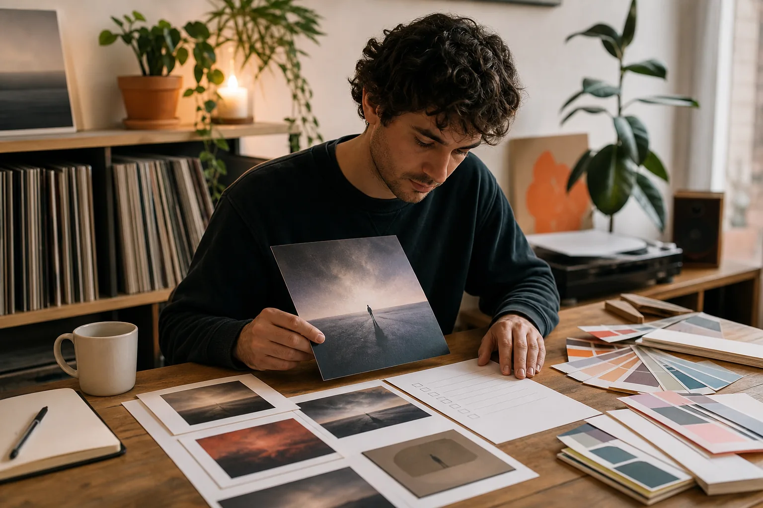
Make One Cover Work in Many Places
Build the main square first. Then make smaller promo crops for posts, profile banners, lyric clips, and email graphics. Keep the key image near the center so it survives a crop.
Make a version without small text for social posts. Make another with extra room for a release date or link. Don't add every detail to the main cover. The cover identifies the record. Promo art can carry the extra message.
When the record is ready, clean audio helps the visual work feel finished. Indepth Jay Beats also provides online mixing and mastering for rappers, with the file handoff built around your track and reference notes. A clean master plus clear artwork gives distributors fewer reasons to send the release back.
Use a final rights check before upload:
Can you prove permission for every image?
Do the fonts allow your planned use?
Is the artist name correct?
Does the cover match the song and genre?
Does the small preview stay readable?
Are your master and delivery files stored safely?
That last check saves more trouble than another hour of effects. Love, Jason.
Album Cover Maker FAQ
What is the best album cover maker for beginners?
The best album cover maker for a beginner is one with editable templates, clear text controls, image crops, and large-file exports. Start with a template that matches your mood, then replace the stock image and type. Before you pay or publish, check the tool's license terms and confirm that the export fits your distributor's requirements.
What size should an album cover be?
An album cover should be a large square file that matches your distributor's current delivery rules. Digital services can resize artwork during delivery, so keep the source sharp and readable. Vinyl and CD jobs need their own print templates with bleed and safe zones. Ask the pressing plant for those specs before setting up the file.
Can I use an AI album cover maker?
Yes, you can use an AI album cover maker for concepts or finished artwork, but review the result closely. Check the tool's terms, remove strange logos, and replace unreadable AI-generated type. You also need to confirm that any source image or visual element has permission for your planned release and promotion.
How do I make an album cover look professional?
A professional album cover has one clear focal point, readable type, and a color choice that fits the music. Use fewer effects and leave room around the key elements. Test the artwork as a small thumbnail. If the artist name disappears or the image feels crowded, simplify the layout before export.
Can I use a stock photo on an album cover?
You can use a stock photo on an album cover when its license allows that use. Read the terms for commercial releases, merchandise, ads, and credit requirements. Save proof of the license with your project files. Never assume a photo is safe because it appears in an image search or has a free download button.
Choose a tool that keeps the design clear, then let the record guide the image. If you need a beat with a strong visual lane, browse Indepth Jay Beats and start with the sound before you touch the template.

Get 20+ Free Beats delivered to your inbox
Drop your name and email and I'll send a pack to your inbox right away.
We respect your inbox, no spam. Promise!